Final Draft
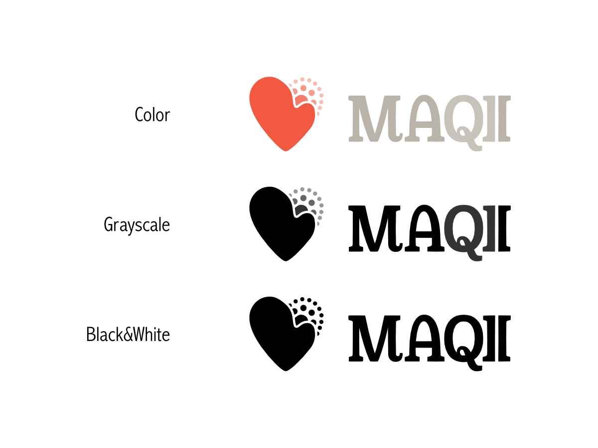
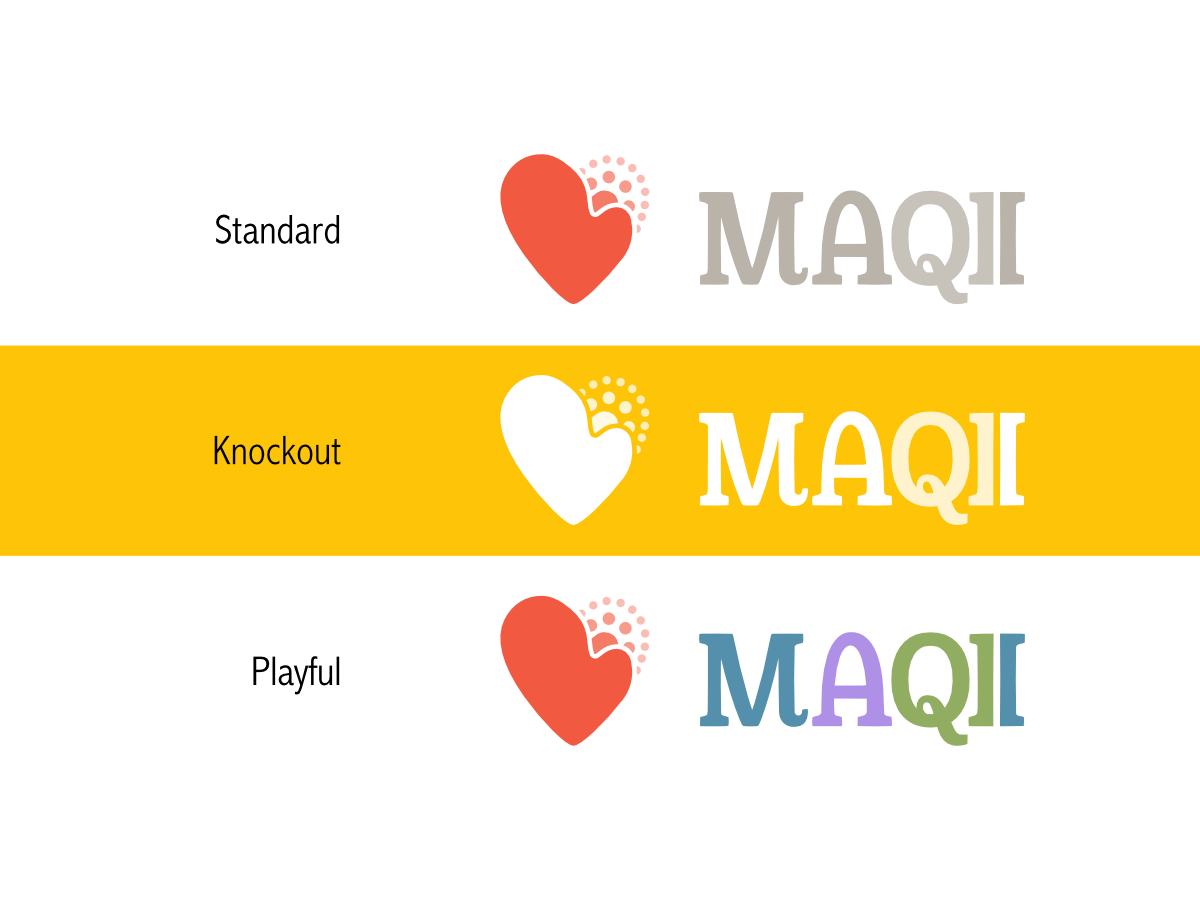
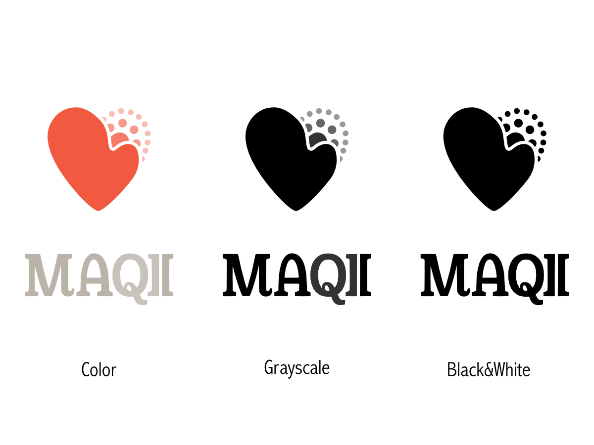
These treatments incorporate the changes we talked about and demonstrate color usage, horizontal and vertical arrangements as well as an alternate text only version of the logo for where icons are not permitted or compete with content too aggressively.
Color Pallet
The color palette used across these examples demonstrate the muted primary colors. These colors were chosen to complement the red heart mark. MAQII is a fun group of people and the use of primary colors represents the often playful environment. Muting these colors adds a level of restraint since we're not all fun and games.
These colors also represent the expansive greenery of Michigan, its plentiful blue waters and the "care" of healthcare (purple). The red is used to emphasize the anticoagulation of blood into a healthy heart in the mark itself.
- Log in to post comments
